Notes from New Sodom
... rantings, ravings and ramblings of strange fiction writer, THE.... Sodomite Hal Duncan!!
- Home
- Projects
- Buy
- Take
- Read
- Explore
- Notes from New Sodom
- Notes on Strange Fiction...
- Strange Fiction
- No Country For Old Men
- ”The Disemboweller”
- ”The Frozen One”
- ”The Oracle Opens One Eye”
- Of Genres and Sub-Genres
- Narrative Grammars
- Narrative Equilibrium
- Seams
- Pataphysics
- Narrative Function 1
- Narrative Function 2
- Narrative Function 3
- Narrative Modality
- Notes on Frye
- Modality and Hamlet
- Mimesis and Maieusis
- Notes on Worldscape
- The Built World
- Notes on the Sublime
- Notes on Notes
- Agendas and Aesthetics...
- An A-Z of This Blog
- Oh Dear Dog!
- Molotovs At Dawn
- Why Do I Infernokrush?
- In The Ghetto
- The Great Debate
- SF as a Subset of SF
- The Walls of the Ghetto
- The Ghetto Within The Ghetto
- A Modernist Prometheus
- The Aesthetics of Fat 1
- The Aesthetics of Fat 2
- The Dufus Dollar
- On Fanfiction
- On Pretentiousness 1
- On Pretentiousness 2
- Eternal Moment of Modernity
- The Epic and the Past
- Dionysius vs Pentheus...
- The Homosexual Agenda
- Protocols of the Elders of Sodom
- THE…. Sodomite Hal Duncan!!
- An Open Letter to John C. Wright
- An Open Letter to John C. Wright
- A Sodomite's Sermon
- Cultural Appropriation 1
- Cultural Appropriation 2
- The Sacred Domain
- The Power and the Piss
- On Profanity
- On Blasphemy
- Wisdom Justice and Mercy
- The Stain of Sin
- A Dark and Hidden God
- The Heirs of Job
- The Halls of Pentheus 1
- The Halls of Pentheus 2
- The Halls of Pentheus 3
- The Halls of Pentheus 4
- The Halls of Pentheus 5
- Learn
- Writing 101...
So the hatemail dubbed me THE.... Sodomite Hal Duncan!! (sic) So I will wear that with pride, cuntfuckers. It's like The Outlaw Josie Wales only better, right? I mean, did he have a fully capitalised THE, an extra-long dramatic pause, and two exclamation marks? No, he did not. Chickenshit.
Find me on:
Follow @Hal_Duncan Become a Patron!


The Book of All Hours
Recent Releases
Also in Print
Ebooks Available
Recent Posts
Sunday, April 23, 2006


3 Comments:
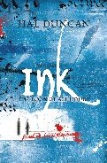
So how do you like this compared to the UK cover? I personally prefer the font design of the Macmillan edition.
Well, I'll have to pick this up for my b-day: it's the 25th! Thank God I didn't order the $45 import last month!
Jason: I've always really liked the white lettering (they used this style on the UK bound proofs before coming up with the black "graving" look). I like that "burning through the Vellum from below" sorta feel and it fits with one particular description -- where Phreedom sees her brother's signature in the motel guest book. I always thought of it as kinda like that.
The Pan Mac scrawly-black logo won me over because it is *really* swish, and after initial reticence I now like it as much as (somedays more than, somedays less than) the burny-white. I love the way they've kept it consistent with the logo they've come up with for INK. I'll be curious to see whether the Del Rey INK cover is modelled on the same art.
Other aspects? The Macmillan cover is less saturated in colour, the Del Rey cover pretty super-saturated. Put them together and you tend to get one-looking wishy-washy and the other looking gauche, but view them apart and they both look striking.
I guess at the end of the day the textured finish of the Pan Mac edition just makes it more strokable, but other than that I'm really hard-pushed to choose between them.
Andrew: Happy Birthday when it comes. I know I speak for myself, my editor and everyone at Del Rey when I say I can't think of a better birthday present you could buy yourself. ;)
Post a Comment
<< Home